Brief
Since 2010 we have tipped the balance when it comes to published content and we entered the digital turn with more content published digitally than on paper. Today the act of “making [information] public” is not a fixed activity but something that can be hybrid and connected, offline and online. We share content through interactive channels that can communicate beyond the page.
I was assigned to understand and design The Mercy Seat sung and recorded by Nick Cave & The Bad Seeds.
Collation and organization of my content
Nick Cave And Bad Seed, a band from Australia, but a weird band that has nothing to do with the freshness and simplicity of Australia.
On the contrary, the Nick Cave And Bad Seed band centered on Nick Cave continues to show deep German cultural ancestry in thought and music. This can be related to the band member Blixa Bargeld, because Blixa Bargeld was the most popular in Germany in the 1980s.
The soul of the momentary industrial noise band Einsturzende Neubauten, and the other members of the Nick Cave And Bad Seed band, such as Mick Harvey, Thomas Wydler, etc., are among the best in the European underground avant-garde music circle.It is precisely because of this that they can create a magical touch that integrates various musical elements.
This is the link to the material I got.
Sketches & Personal Thoughts
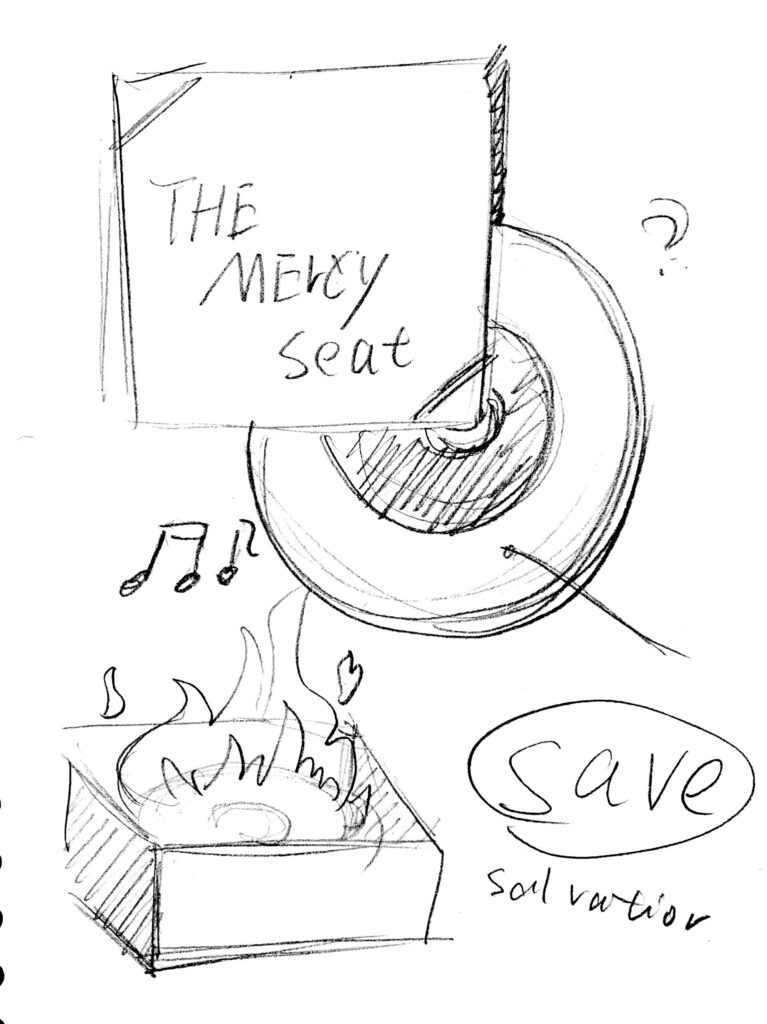
I feel that even though the song is filled with anxiety, pain and struggle, there is still an expression of hope for salvation.The author is like a person with a fire in his heart. In the content of the video, the lead singer seems to be talking in a small space.


My target audience is the audience of this singer or people who want to simply appreciate this song.
So I made a dynamic poster in the form of a record package.
It’s like a restless CD, I can’t wait to tell my story to the audience.
Design Result
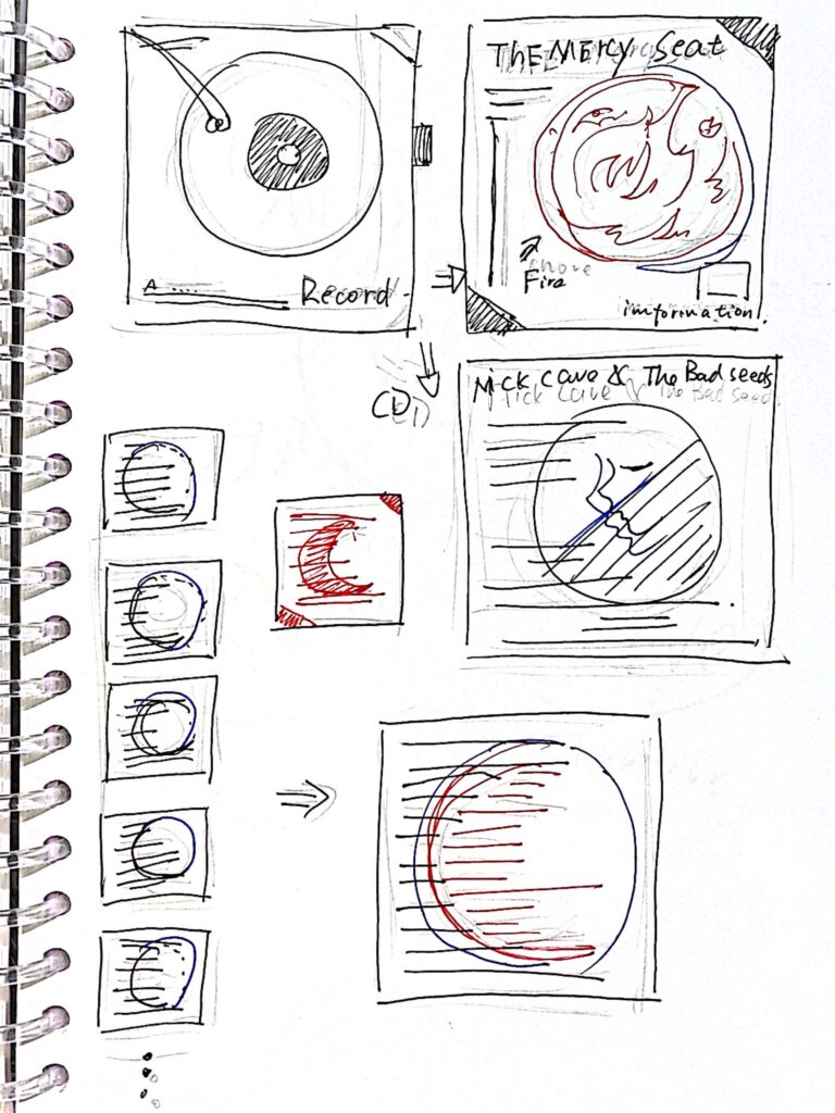
The cover mimics the shape of flames, implying the hope of salvation and pain in the song.A QR code link to the video website is also made in the lower right corner, so that people who are interested can continue to understand it.
I put a processed video clip and an introduction to the band on the band’s introduction page.In the typography of the lyrics and the back cover, I designed the text to resemble a red moon, representing anxiety and struggle.


