Author Archives: rf1c20
The challenge of the project of four and thinking
By the time I write this blog, I have finished shooting and producing project 4.
When I saw the project selected topic very diverse, I have been feel confused. I think every big topic under of the small problems are very attract me, I can’t immediately in these selected I want to make the research project. As I read the big topics, I felt that each topic caught my attention. But there was more variety in the small questions than I expected. But I find that a large part of the subject are interrelated. City, population, water source, pollution, poverty, and they are all involved with each other in the human development problems and the reasons. It’s really very interesting. In the end, I decided to choose urban expansion as my performance goal, which I thought might be suitable for me.
Of course, I also had difficulty in production process. I can’t go out and shoot quickly and get good results in a short time. Therefore, I decided to use low-cost shooting and convenient experimental images to express. Fortunately, finally successfully completed the production, even though I don’t is very satisfied. But at least it has already expressed what I want to express.
Purpose
The project aims to:
Explore speculative and critical approaches to your topic topics.
Continue to develop your thinking on the topic by following these steps
Narrative based on continuous time.
Knowledge of film production and editing.
Deliverables
a 30-second film that explores the results of your research on your topic
Paper storyboards
Study folders and sketchbooks
Topic selection
The topic I chose was urbanization. What I want to do in this video is talk about growing populations and the cities they live in, the picture of human life in cities.
Background Research
Problems arising from urbanization:
It matters not only for today, but for tomorrow, for future generations. Once a city is built, it cannot be torn down easily; What is lost in urbanization is also difficult to recover.
In the process of the growth of the cities, different reasons can lead to urban development in different forms.
Three types of urban form
1. centralized
Cause: Formed by the strong attraction of the city center.
Advantages: Convenient for centralized setting of life service facilities, convenient life of residents; It is convenient for administration and saves investment in municipal construction.
Disadvantages: facilities centralized, environmental problems prominent.
2. Group type
Cause: due to a number of pieces of discontinuous urban land, between the pieces of farmland, mountains, rivers, forests, etc.
Advantages: Each group can organize their own production and life nearby.
Disadvantages: land is scattered, contact inconvenience, municipal construction investment is big.
3. Strip type
Origin: Developed under the influence of traffic lines, or along valleys or water shorelines influenced by topography.
Advantages: Urban parts close to the suburbs, close to nature.
Disadvantages: urban traffic is concentrated in one or two directions, the transport distance is longer.
Brainstorming

Sketch
I have a strong demand for the point-like distribution form of urban development, so I simulated the appearance of the three urban development forms in the background data on the sketch.
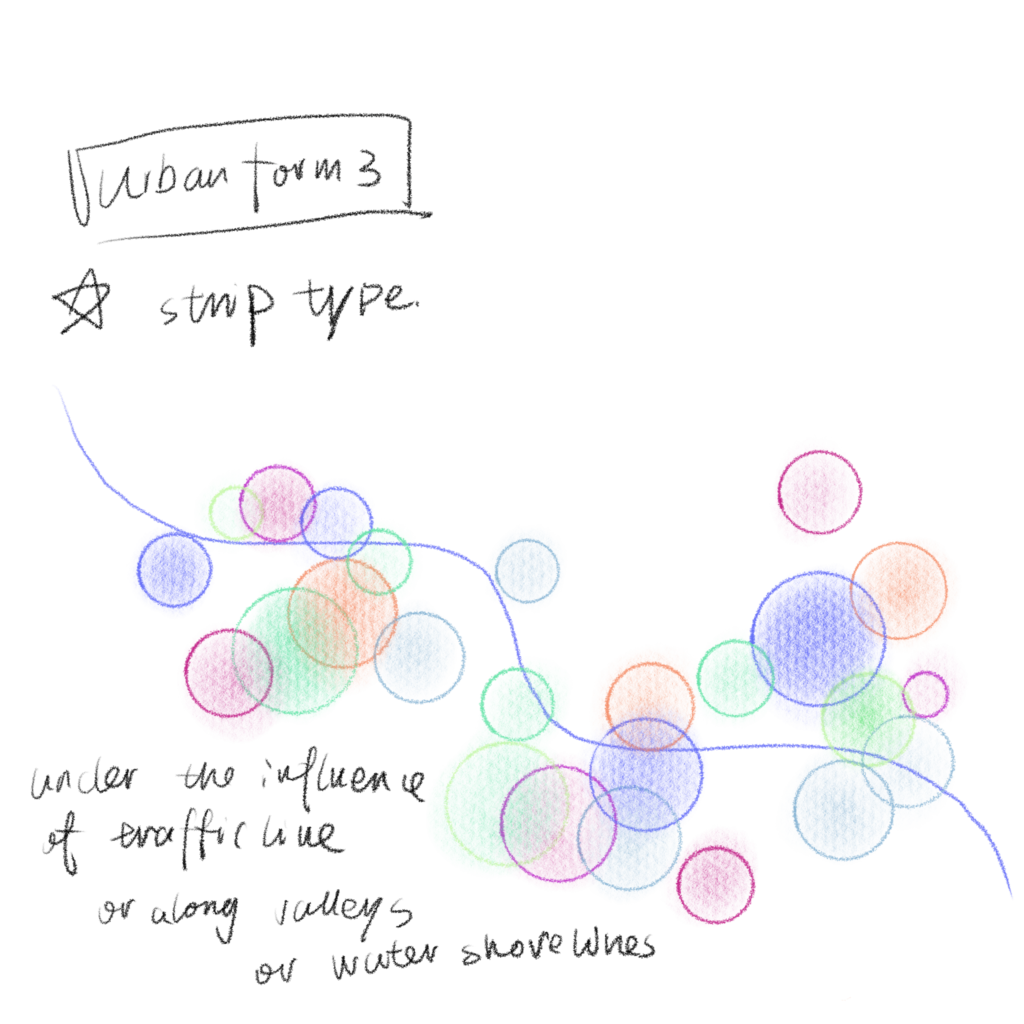

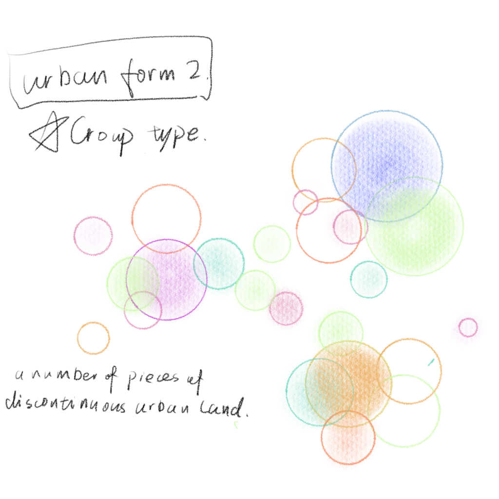
Video
What have I done to an experimental video to represent three different forms of urban expansion and production change. At the same time, it also considers the problems of human social agency caused by urban expansion and the changes brought by urban radiation.
Artist appreciation
Damien Hirst
Damien Hirst is currently the highest-paid living British artist, leading the Young British Artists Association (YBA), whose work explores the origins of life, Death and love, as the two most important elements, often appear in his highly controversial sculptures, paintings and installations. Skulls, dots and butterflies have long been the symbols of Damien Hirst.
The title of the item below, “I was you, but you will become me,” is a reference to a famous Roman epitaph. In the 17th century Dutch vanity in painting, the skull is seen as the most important subject material, and often with flowers and fruit and place in the middle of the picture. Damien Hirst added some playful and ironic skull symbols to the piece, combined with his signature diamond studs.

In 1988, Damien Hirst exhibited his polka dots for the first time, and it quickly became one of his most iconic series. The original creative inspiration comes from pharmaceutical companies for life science research methods, inspired by the artist tried to use a new kind of scientific way of painting, and record those by changing the color of the dot, location, size and the numerous unique arrangement. He said: “mathematics, through these dots painted, I seem to have found the most essential thing – the color of the artistic creation harmonious and perfect interaction with other colors.”
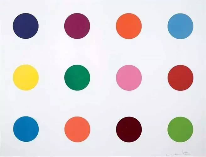

The LSD (LSD) (Lysergic Acid Diethylamide (LSD)), painted in 2000 Lot ID: 119229 media: Lambda inkjet printing
An artist who is gradually drawn into the chain of capital. Early works “one thousand”, “unimpressed by the living to the dead at the time of the context is very fashionable.
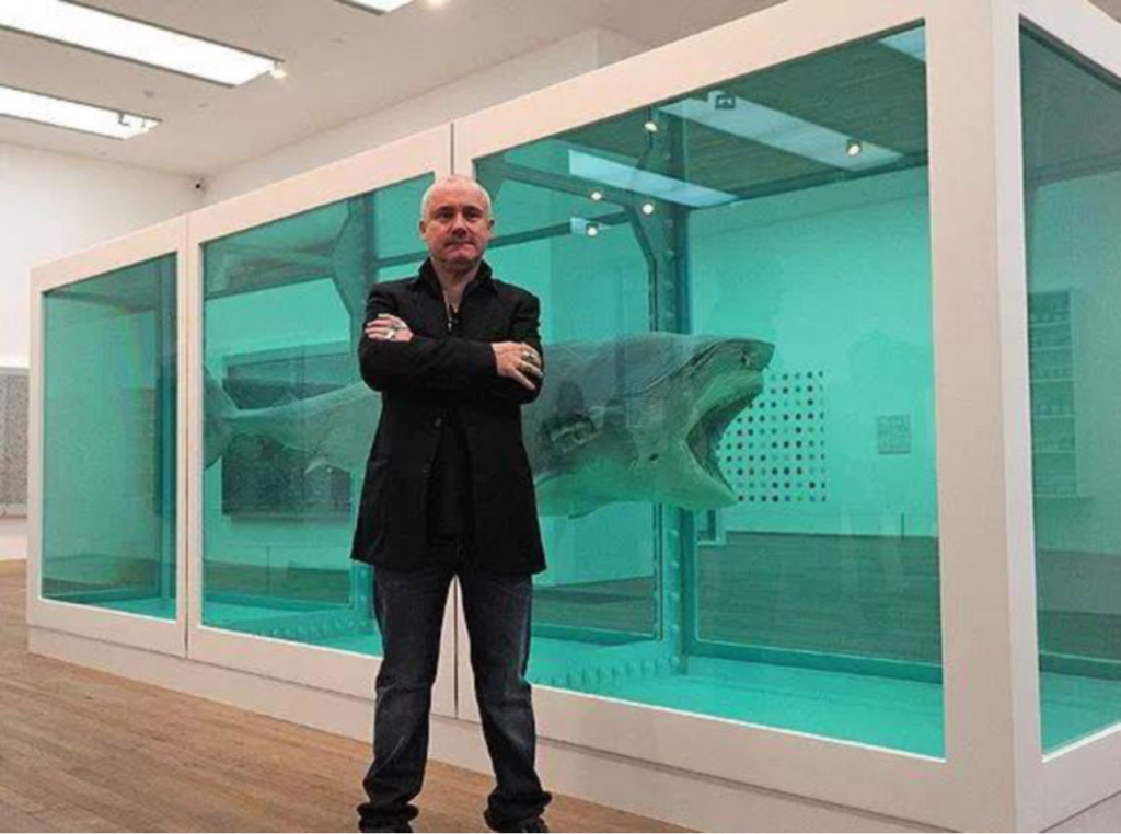
Damien hirst. This work, funded by the sellers saatchi is 6000 pounds caught sharks in Australia, spent more than 50000 pounds of the cost of production. He has to save sharks in formaldehyde solution, and called the unimpressed by the living to the dead.
Just think if works simply referred to as the “shark”, the value of it and geometry. “The living to the dead indifferent” this sentence to express ideas moment remind viewers, you in the face of the bodies of the animals, because of the human and the loss of life. The work sold for $12m in 1992, making it the second most expensive modern and contemporary art in the world at the time.
When people ask Hirst why the work sold for such a high price, he explains: “It’s very simple. The seller is Saatchi, the broker is Gagosian, the buyer is Cohen, the artist is me. You have four of the biggest names in the art industry together, and you have the media, and you have unique brand value.”
Brief
Use the work generated by Publishing Platform Presentation 02 to create team projects as a group. It can use do you think of the right, in any form.
Team members
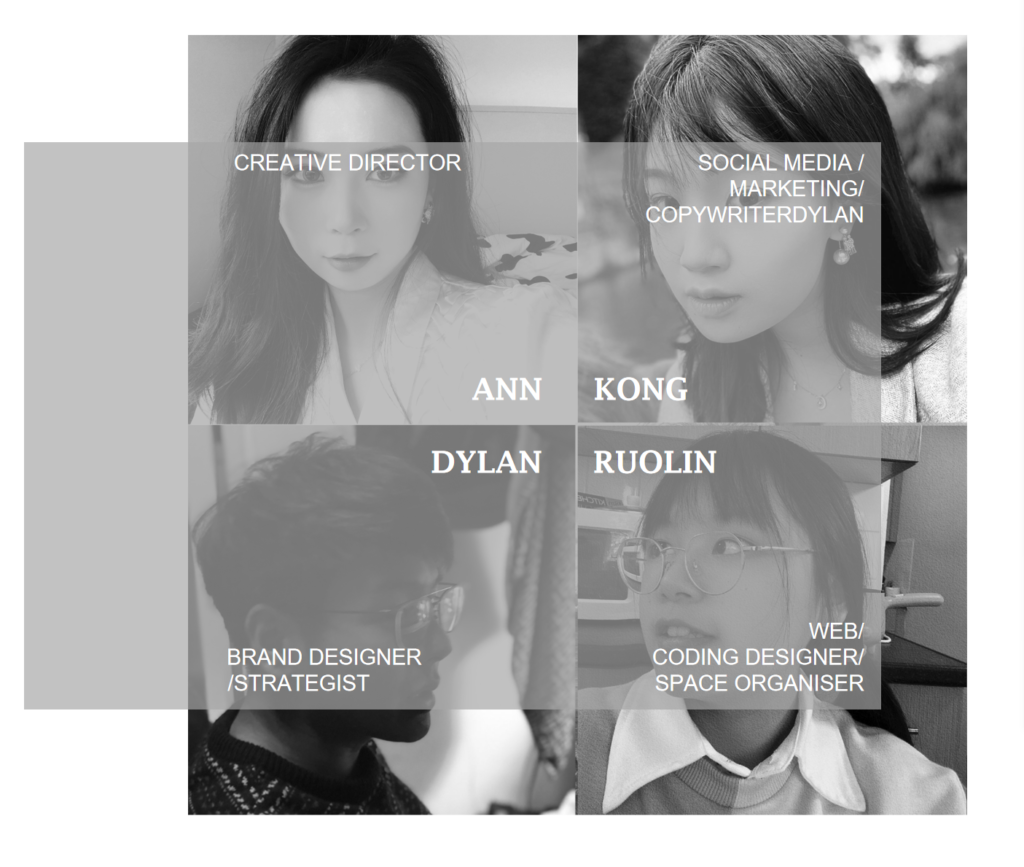
Unlike previous project, this is a project need team cooperation. Reconstruction of The project requires us in The form of group and editor Nick Cave of The band’s songs, Mercy seat. Therefore, before the start of the project, we need to make sure your role, I chose the WEB/CODING DESIGNER/SPACE ORGANISER as my role.
- Role of team member
1. BRAND DESIGNER / STRATEGIST
To oversee the design of the identity of your Volume/container
2. CREATIVE DIRECTOR
To overview the creative process as a whole.
3. WEB/ CODING DESIGNER/ SPACE ORGANISER To bring functionality to the design form/space. (Selected)
4. SOCIAL MEDIA / MARKETING/ COPYWRITER
To create a marketing plan and associated graphics.
We decided to design interactive media display for fans of the song and people who want to know about the song based on the group members’ existing works and using social media as the carrier.
The minutes of the meeting
1st Meeting 23 July 2021
Attendees: Ann Ruolin Dylan Kong
Content of the meeting: the presentation of their research results and homework results
Meeting place: Teams Group meeting (online)
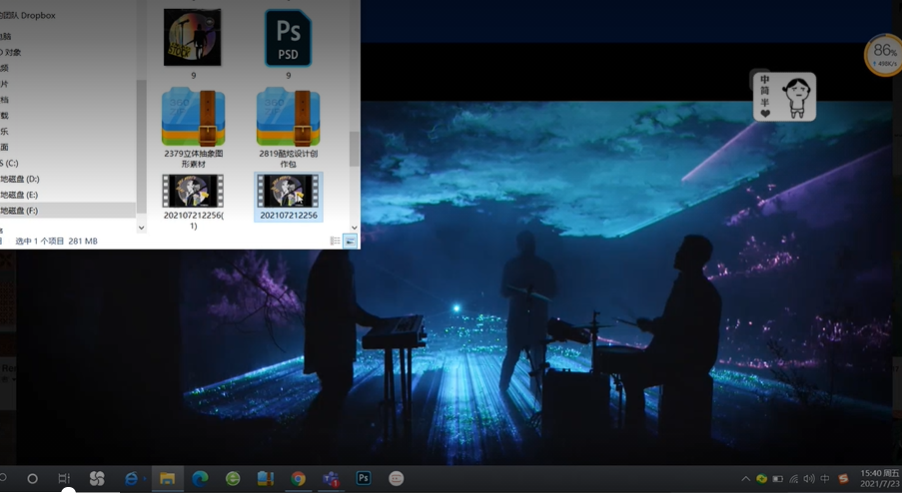
Kong:
The style of my final presentation was a combination of goth rock and vinyl. In order to better fit the repetition in the song content and the helpless psychological mood of the singer, THE form of GIF is adopted to show the state of repeated and continuous singing.
Here’s the first one… The second chart is…. The last image shows the receding figure, which also indicates the end of the book.
Ann:
@Dylan why don’t you show me your work first?
Dylan:
Ok
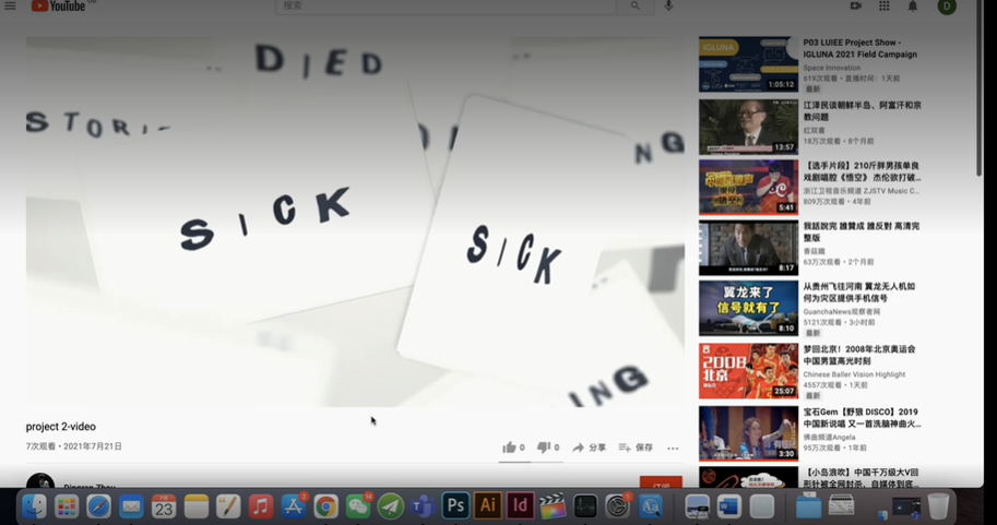
My final work is presented in the form of font transformation. And made these fonts to feel like they are swimming in water. The song is full of religious elements, and water is one of the most important elements of religion. I extracted key words from the song and arranged them in a font I designed. Finally, I chose to show it in the form of video.
That’s the end of my presentation. Ann, what about yours?
Ann:
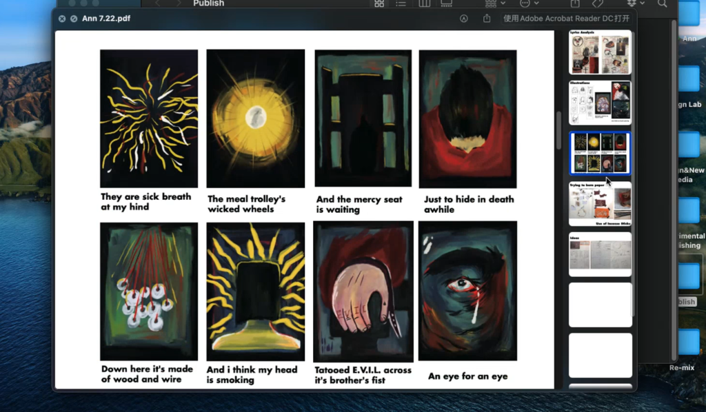
Well, my final form is a physical book. I haven’t finished the final shot yet, so LET me show you the layout of the digital version.
Dylan, Kong and Ruolin:
B: Ok.
Ann:
I reinterpreted the Mercy Seat. I designed and produced some illustrations to show the content of the lyrics. My final plan is to use these illustrations and the text of the lyrics to create a physical book with multiple forms. Many different materials make for a diverse reading experience. It’s space, vision, smell and touch.
And then the shoot for my physical book will take place next Wednesday. We’ll share it when it’s done.
Ruolin:
So let me show you my content.
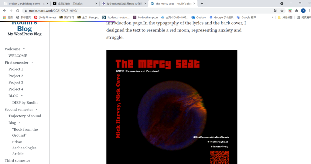
I directly published the content on the collection of works website, you can log in to watch more detailed content. Time is limited, so I will briefly introduce the content of my work.
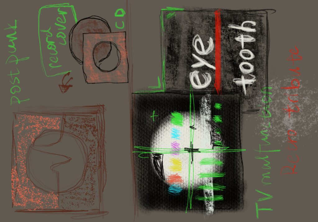
My target audience is the singer’s audience or people who want to play this song. So I made a dynamic poster in the form of a record pack. It’s like a restless CD. I can’t wait to tell my story to the audience.
Ann:
Why don’t we just call it a day? And then we’ll have a meeting at school when we’re all free?
Dylan, Kong and Ruolin:
B: Ok.
Achieve your goals:
- Have a basic understanding of each team member.
- Understand the content and expression of the team members’ works, laying a foundation for the composition of the following works.
- Set the time of the next meeting, prepare the preliminary material sorting work respectively, and improve the output efficiency of the next meeting.
2nd Meeting on 28 July 2021
Attendees: Ann Ruolin Dylan Kong
Meeting content: Discuss the basic plan of project 3 and determine the division of labor
Meeting place: School cafe
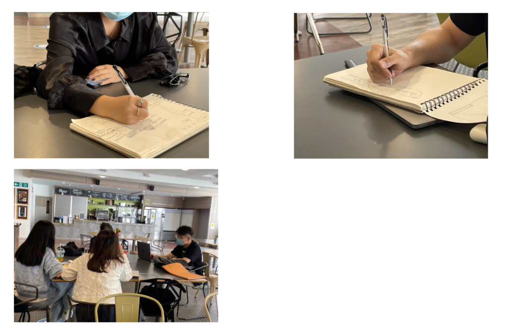
Ann:
Let’s talk about the division of labor, okay?
Dylan:
My work is more flat, I can be a brand designer, do some graphic work. Or help you do some videos.
Kong:
Will our final content be presented in video form
Ann:
I think we can finally adopt a mixed video clip to reflect your work. And then use the text Dylan designed.
Ruolin:
I could do video editing or web publishing. I’m better with AE
Kong:
Why don’t I work in marketing? I worked in a related field in my previous job.
Ann: Ok, I’ll be the director and work with Ruolin on remix. Then shall we discuss the form of Brief III?
Dylan: I think it’s ok to mix video clips, but I don’t think it’s necessary to re-edit music.
Ann: I think it will be more dynamic.
Ruolin: I think you can just use some dynamic drums.
Kong: Either we can find something similar and edit it, or I think we can just use the pure music from the last track of the Mercy Seat.
Ann: We can look for music works separately. So, you guys split roles, or I’ll be director.
Dylan, Kong and Ruolin:
Ok
Kong: I think the video format is good because dylan and Ruolin are basically video formats. And then Ann, your content I think can be mixed in at the end.
Ann: Yes, but we also need to discuss the style of mixed cutting.
Dylan: You can use my font for subtitles. Or I can provide you with the source file, you can multiply the color, and then unify the color.
Ruolin: Ok, let me make a sample first. We’ll see then.
Kong: I will compile a plan for the content of social media and post it in the group for discussion.
Ann and Dylan: Ok
Achieve your goals:
- Define your division of labor
Dylan: Better strategy
Perform graphic and visual design work. Font design, poster design, logo design. And assist other related visual work.
Ann: CREATIVE DIRECTOR
Control the overall plan of the team, be responsible for the overall planning of time, and coordinate the work content of team members. And assist in web design and graphic design.
Ruolin: WEB/ CODING DESIGNER/ SPACE ORGANISER
Responsible for web design, video production and other coding related technical work. To bring functionality to the design form/space.
Kong: SOCIAL MEDIA/MARKETING/ COPYWRITER
Responsible for the marketing of the finished product display, and write the plan. And for meeting minutes and other related text editing functions.
- Finish your work separately, at the next meeting. Bring your own preliminary work.
1st Meeting 29 July 2021
Attendees: Ann Ruolin Dylan Kong
Meeting content: Preliminary work delivery
Meeting place: Teams Group meeting (online)

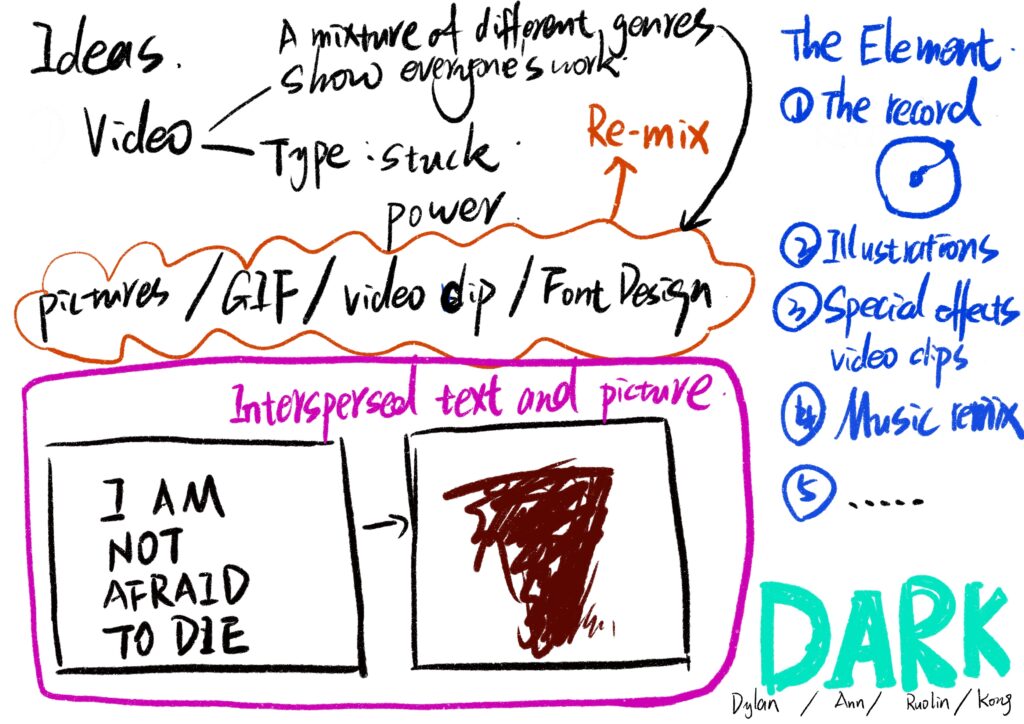
Ann: The previous plan may need to be improved. Andy: We need to show everyone’s work in its entirety. Then we might not be able to do the mix cut
Kong: So are we going to edit sequentially or put everyone’s stuff together?
Ruolin: That’s either dark, or everyone’s name in AE remix.
Dylan: I think we can handle the change of pictures based on the rhythm of music.
Ann: Ok, that’s ok.
Ruolin: Or we could create a web page to showcase your work.
Ann: I think so. Then I will cooperate with you in making web pages and cutting videos. The video still needs to be done.
Kong: I can edit the video again for social media release. So I think the video still needs editing.
Dylan: Then I’ll stick with the visual aspects of the poster. Or do some individual posters with propaganda can also be.
Ann: I think so. Then you make some web ICONS and make a logo.
Dylan: ok
Kong: Logos can also be used for social platform announcements.
Ruolin: Posters can be used on the cover of web pages.
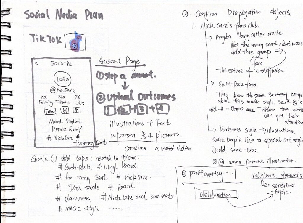
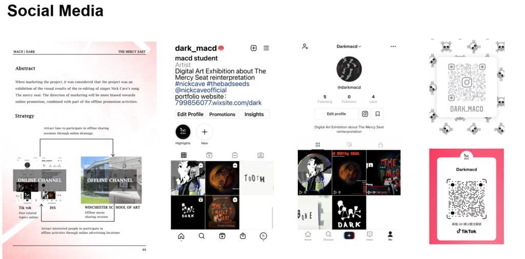
Kong: I plan to publish social media on Instagram and Tik Tok. Take INS as the main visual display platform. There’s a lot of Talk about Nick Cave on Instagram.
Ann: Yes.
Kong: Tik Tok can be used as an aid.
Achieve your goals:
- Modify the scheme from the original single video display to the display direction of web page plus video.
- Modify your work direction. Establish specific implementation plan
4th Meeting on 31 July 2021
Attendees: Ann Ruolin Dylan Kong
Meeting content: video style discussion, poster suggestions modification
Meeting place: School cafe
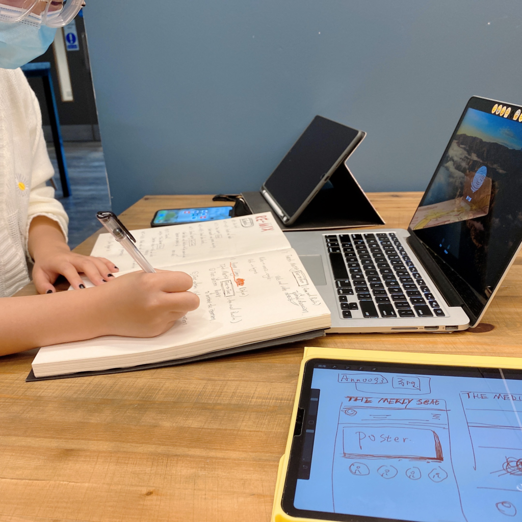
Ann: Ruolin and I searched some video styles yesterday and uploaded them to Teams.
Dylan: Ok, KONG and I have seen it. I think the style of the video is ok, and my works tend to be concise.
Ann: It can be used as an expression of font variation.
Ruolin: I think music can be presented with fast drums. In this way, the works with everyone can leave a strong visual impact and attract the attention of the audience.
Kong: In my social media presentation, I will capture some more dynamic music from the Mercy Seat.
And the personal video presentation part, I might compress it. Think ins and Tik Tok are sometimes long limited.
Ann: Yes, but I think we should show your complete works.
Kong: Then I can use an atlas to complement the presentation.
Ruolin: That part of the video I think can be nailed down like that.
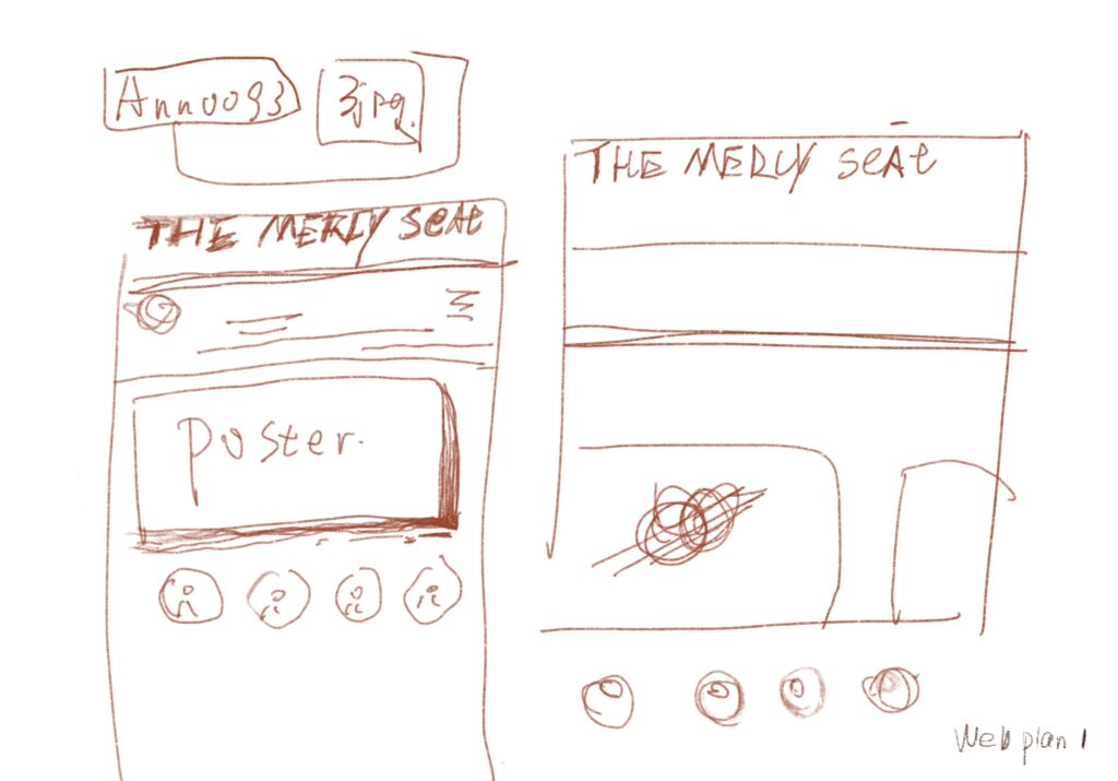
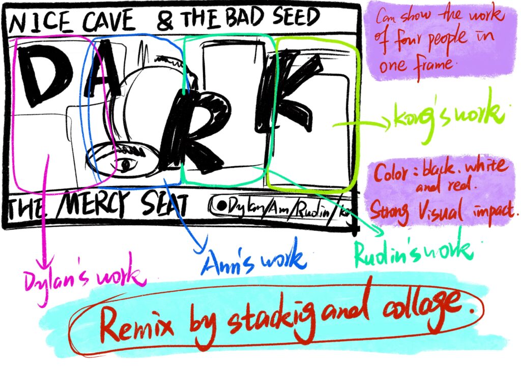
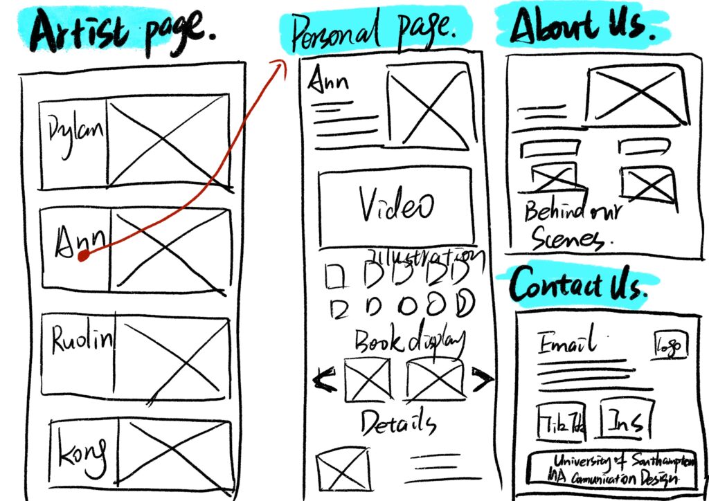
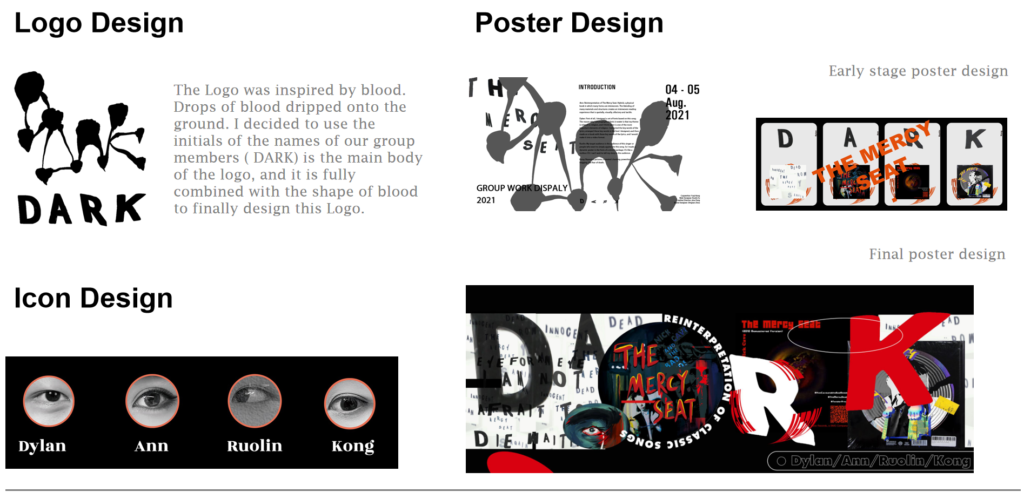
Ann: After discussing the layout of the web page with Ruolin, I decided to use Dylan’s poster work of four people as the opening page of the web page.
Dylan: You can use the element of four people’s eyes as the icon of the personal page entry link.
Ann: I think so. The personal page is still used to display your works comprehensively
Ruolin: The video CLIPS I made earlier can be used as an introduction to the web page. It can also be regarded as a preview of the exhibition of personal works.
Kong: OK, I have some paintings that are not quite the same. You can tailor them according to the situation.
Ruolin: Ok.
Achieve your goals:
- Determine your video style. Plan your videos to be short videos of 20-40 seconds.
- Determine the music style. Choose an up-tempo music style with heavy bass and bubbles.
- Do an initial iteration of the layout.
5th Meeting on 2 August 2021
Attendees: Ann Ruolin Dylan Kong
Content of the meeting: posters and videos were revised and iterated, and the form of marketing was determined
Meeting place: Teams group meeting (online and Offline)
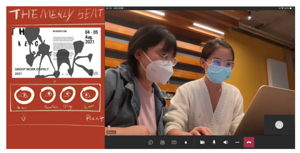
Dylan: Let me show you my poster first. The poster is mainly made by using the font I designed and the introduction of each work. Then I used the strong elements of black and white contrast. Can better highlight the text to express the content.
Ann: I think the style may be too bland. I think the style of the poem is still a little bit darker.
Kong: This song is still death rock.
Ruolin: I think we can still add a little bit of gothic to it.
Dylan: Andy said earlier that the song’s style is not bloody. But I think there’s still a gothic element to it. You can also add some religious elements to it.
Kong: The Mercy seat is typical, or water.
Ann: I think we can modify it and incorporate some of your works.
Ruolin: Yes, most of our work is dark.
Dylan: Ok, I’ll discuss it with Ann and modify it in accordance with her website.
Ann: Ok, let’s revise each one. Kong: Could you introduce the marketing part?
Kong: OK, I think I plan to launch marketing in two ways. Start by Posting some photos on Instagram to show off your work. And in the quick shoot part of the release of their video introduction. The snapshoot’s dead for 24 hours. But I think I can do a long-term maintenance.
Ann: Try to be complete anyway.
Kong: ok
Dylan: Your individual poster profile can be used as an Instagram cover.
Ruolin: Mixed cut videos can be used for Tik Tok platform publishing.
Kong: Ok, I’ll take them all into consideration.
Achieve your goals:
- Put forward specific suggestions for the modification of posters and videos, and set aside time for the modification.
- Determine the final main color of the page and the layout and color of the sub-pages.
- Establish the final form of promotion on social platforms.
6th Meeting, 4 August 2021
Attendees: Ann Ruolin Dylan Kong
Content: Discussion on the presentation form of the final presentation
All content is ultimately presented in the form of the establishment
Meeting place: School cafe
Ann: Can I show you the final video Ruolin first?
Ruolin: Well, the final video was mixed cut. Take the works of four people as the theme, with rhythmic music to explore. Changing pictures can match the rhythm of the music, which can make the whole video more powerful. In addition, black was chosen as the main color of the video, and Dylan’s font was used for color transformation. The final result is much more variable.
Ann: Ok, let me introduce the web page that Ruolin and I made.
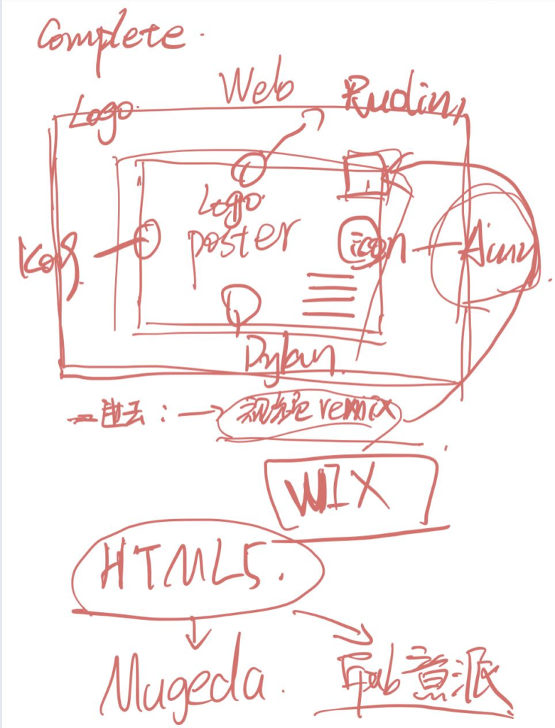
The web page is finally made with MIX, which will be more interactive. The homepage of The website first shows a large poster content to highlight The theme of The Exhibition: Digital Art Exhibition about The re-interpretation of The Mercy Seat. In addition, the song introduction about the Mercy Seat is added to facilitate user groups to have more detailed understanding. And in the web page there are personal work introduction and personal works introduction page.
Dylan: For the one-man poster I made, I used each person’s initials to highlight the individual. And the initials form the word “dark”. “Dark” refers to the theme of the song, as well as the names of the group members. In addition, I made the icon of the button to enter the personal page according to the characteristics of each person’s eyes. The eyes can represent us to see the world through the song, and the audience can also see our understanding of the work through the eyes.
Kong: OK, let me talk about the final social media release plan.
I plan to spread the message in a wider range through the platform of INS. And detailed, targeted tagging along with Posting content. By doing so, our target audience will pay attention to our work while browsing related topics. In addition, I paid attention to many target users through the official account created by this exhibition. Once these target users can be closed back. Ultimately, we’ll get more engagement.
Ann: I don’t have any problem with the specific scheme operation. So in the presentation on Thursday, we will mainly show the part of the webpage. As I am also the creative director, can I mainly report to the teacher and explain the work, while other students answer questions?
Dylan, Ruolin and Kong: Okay, sure.
Achieve your goals:
- Sort out the final project results
- Establish the final form of reporting
- Determine the speakers and q&A candidates for the report.
Sketches
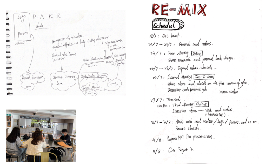
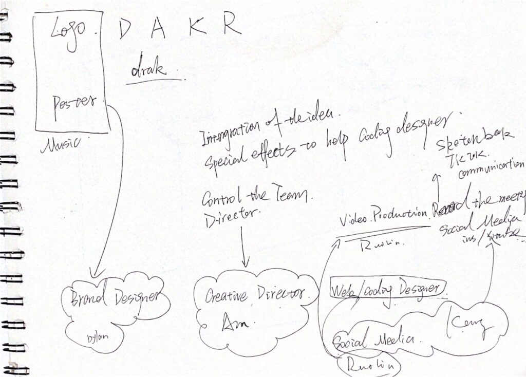
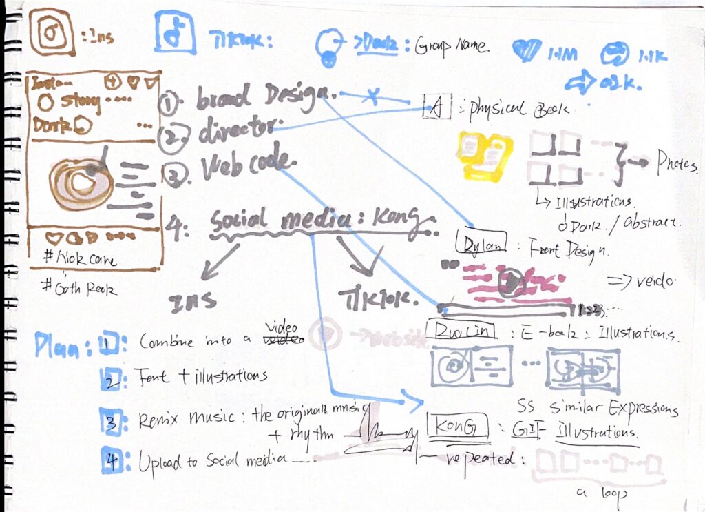
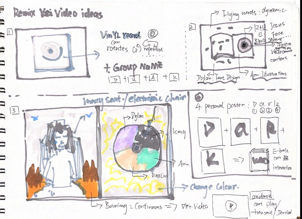





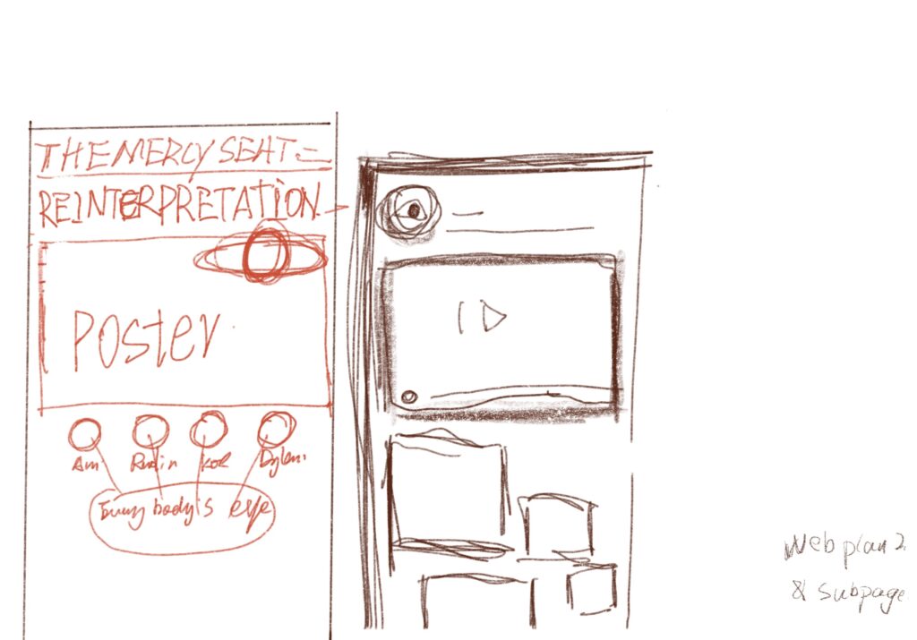
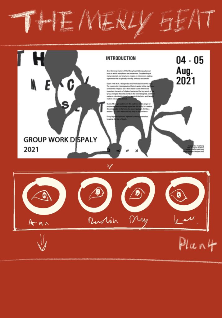
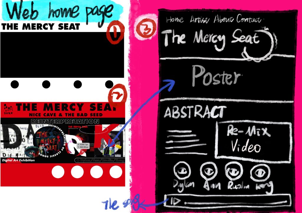
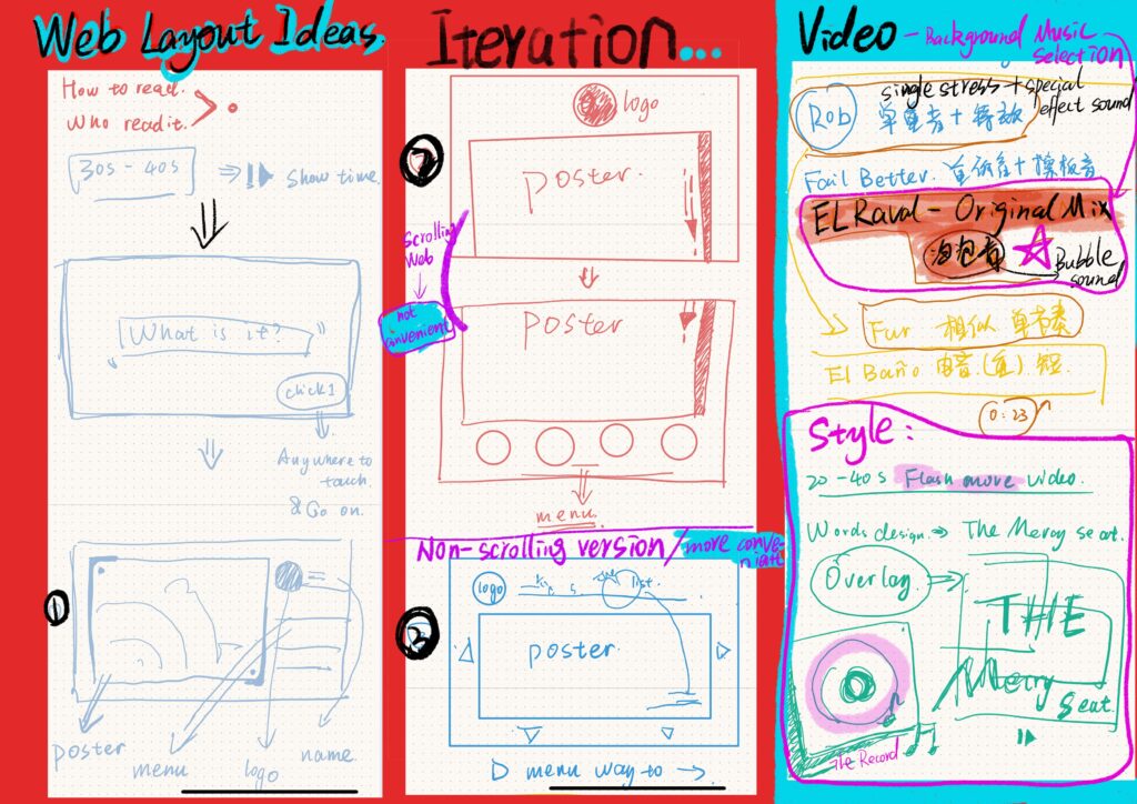
Promotional video
Running results
https://vm.tiktok.com/ZMdTPpetp/
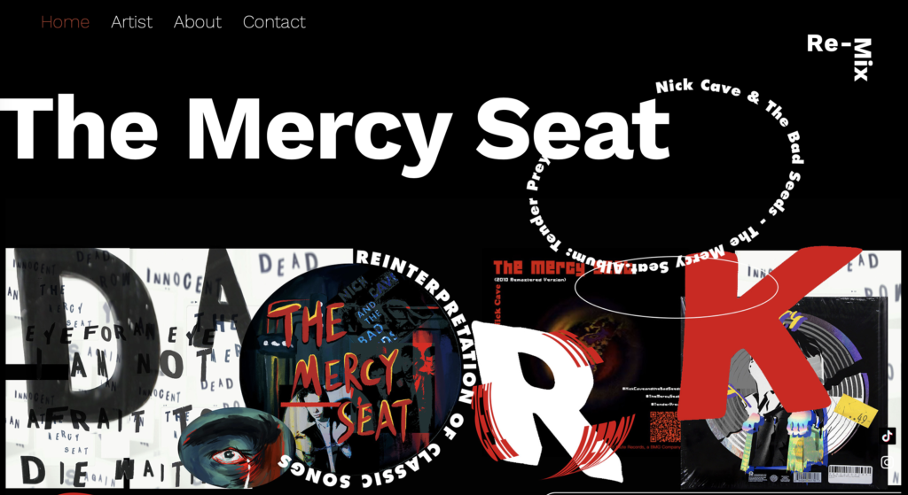
https://799856077.wixsite.com/dark
Statement
In p3 learning tasks, p2 was assigned to the students of the same topic to contingent, with a group of four situation in p2 p3 task again on the basis of the creation.
My work in the team is WEB/ CODING DESIGNER/ SPACE ORGANISER. Our group’s plan is to aggregate and reinterpret the themes of our P2 content through the Internet platform. Therefore, my job is to re-create p2 works of four members of our group and present them to the audience through videos and websites. I work by the following parts, respectively is the editor of video production and website design.
Video production: 1. Observe the work of team members and find common ground between them. 2. Communicated with members and collected the main elements of video production. 3. The combination of The Mercy Seat style and features of The rock for The creation of The video. 4. Draw the video points mirror and frame structure, and to output the video. 5. Analyze and modify the long rhythm and length of the video to make it more suitable for appearing on the homepage of the website.
Web page design: 1. Conduct web page design and first operation experiment. 2. Modify and delete the less expressive content on the web page. 3. Sketch and check web pages. 4 web page creation and operation.
Others: 1. Conference notes. 2. Sketches of videos and web pages.
In this work, I want to, I and my team members’ understanding of this piece of rock and the easiest to read directly with enough to show the fans of this song and want to know about it. So I made many changes in the production and editing of videos and web pages. I think this process is a redesign. I hope our website platform can use the fastest speed to catch the reader’s attention, and let them have interest to move on. Therefore, I discussed with Ann for a long time in the design of the video and website. After correcting and demonstrating many details in the draft, I decided to adopt a large number of contrasting colors and red and black and white colors that I thought could best reflect the mood of the song, so as to make it more attractive and let the audience be immersed in the content of the song.
I also encountered some difficulties in my work. The biggest difference between it and the previous projects I completed alone was the change in the number of people. It means I’m not just dealing with myself at work, I’m dealing with my players. The four of us has a different work and design way of thinking. For me, before making video of our work in this paper, the content of the communication and the common ground of summary and induction is very important. Four lives far apart for us players?, online communication seems to be no offline communication more efficient. This was something that really bothered me at the time.
About I feel a little bit sorry, is our time in p3 project is very hurry, some things not to discuss and plan was carried out so much, there may not be so perfect, we expected but still make me happy is that we successfully completed the project.
Brief
Since 2010 we have tipped the balance when it comes to published content and we entered the digital turn with more content published digitally than on paper. Today the act of “making [information] public” is not a fixed activity but something that can be hybrid and connected, offline and online. We share content through interactive channels that can communicate beyond the page.
I was assigned to understand and design The Mercy Seat sung and recorded by Nick Cave & The Bad Seeds.
Collation and organization of my content
Nick Cave And Bad Seed, a band from Australia, but a weird band that has nothing to do with the freshness and simplicity of Australia.
On the contrary, the Nick Cave And Bad Seed band centered on Nick Cave continues to show deep German cultural ancestry in thought and music. This can be related to the band member Blixa Bargeld, because Blixa Bargeld was the most popular in Germany in the 1980s.
The soul of the momentary industrial noise band Einsturzende Neubauten, and the other members of the Nick Cave And Bad Seed band, such as Mick Harvey, Thomas Wydler, etc., are among the best in the European underground avant-garde music circle.It is precisely because of this that they can create a magical touch that integrates various musical elements.
This is the link to the material I got.
Sketches & Personal Thoughts
I feel that even though the song is filled with anxiety, pain and struggle, there is still an expression of hope for salvation.The author is like a person with a fire in his heart. In the content of the video, the lead singer seems to be talking in a small space.
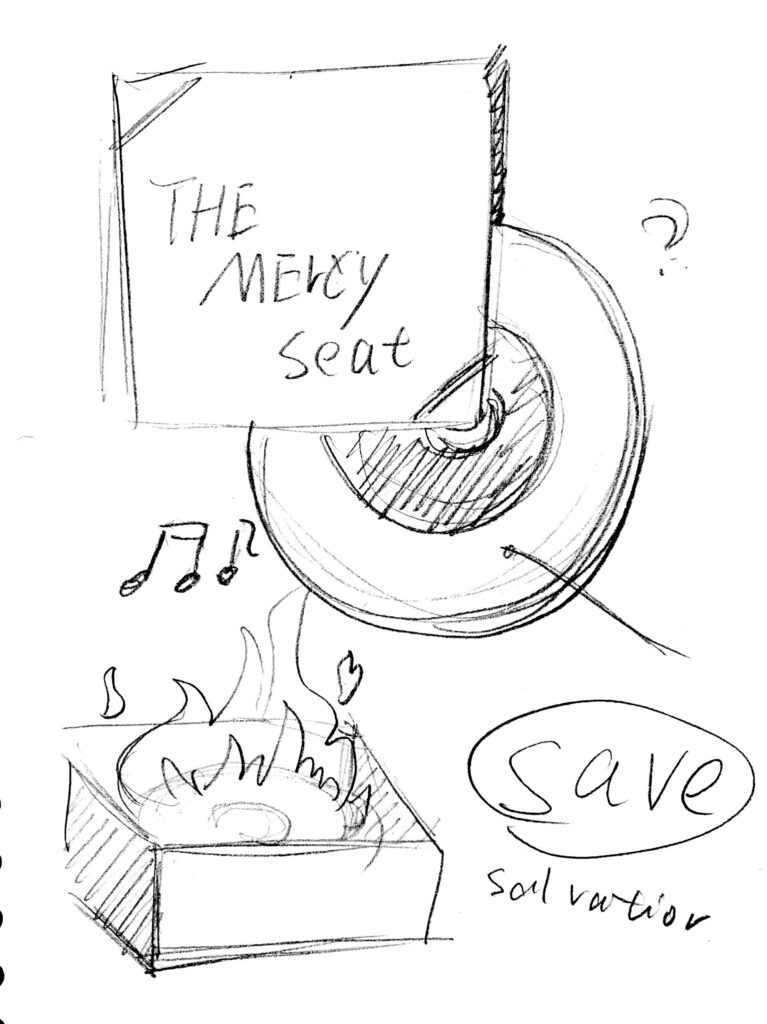
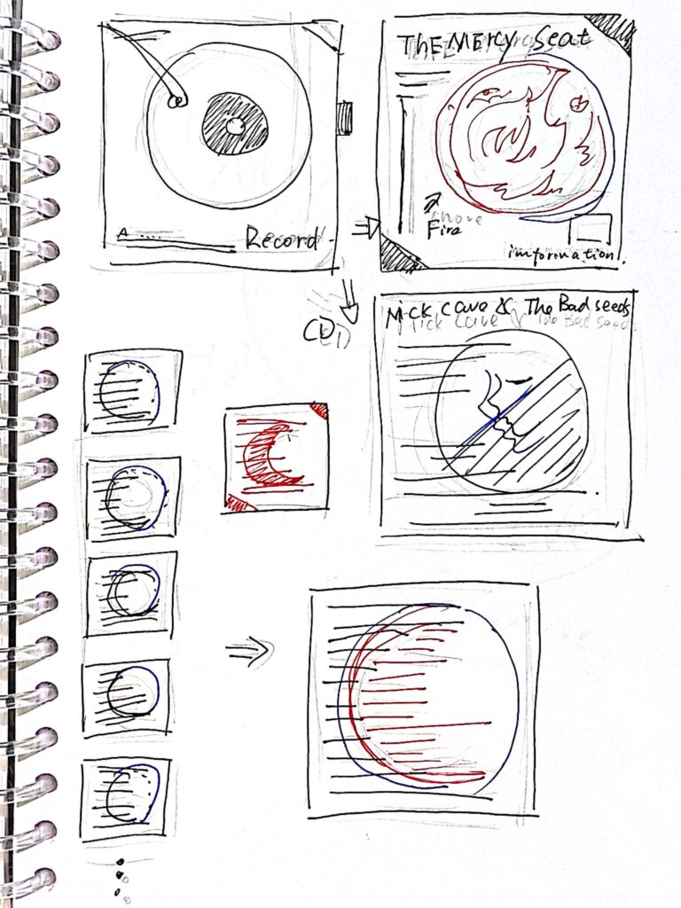
My target audience is the audience of this singer or people who want to simply appreciate this song.
So I made a dynamic poster in the form of a record package.
It’s like a restless CD, I can’t wait to tell my story to the audience.
Design Result
The cover mimics the shape of flames, implying the hope of salvation and pain in the song.A QR code link to the video website is also made in the lower right corner, so that people who are interested can continue to understand it.
I put a processed video clip and an introduction to the band on the band’s introduction page.In the typography of the lyrics and the back cover, I designed the text to resemble a red moon, representing anxiety and struggle.


Data visualization collection
Everyone is immersed in a variety of sounds every day.
The auditory experience can convey more life information and stories to a large extent, which I think is very attractive.
This project tells the story of life in the form of sound recording and data visualization.
Data collection and analysis
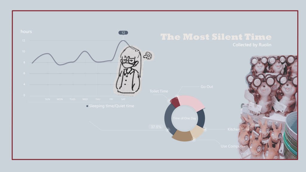

1.Quiet sleep takes up a lot of time in a day
2.The place where the most noisy time period is recorded is in the kitchen
3.I came here to study and live and feel the rain is longer
Visual Display
I collected sound materials for various occasions in a week, and sorted and edited them by overlapping audio tracks, so as to enrich the listening experience.
The sound track is processed through the computer, and the sound visualization is produced, hoping to give the viewer a more comprehensive audio-visual experience.
Reflection
Collecting data and editing is a very meaningful thing.
For data collection, in my opinion, it is roughly divided into two categories.
One type is that the model has been established in advance, and data needs to be collected according to the needs of the model, such as comparative analysis, regression analysis, measurement system analysis, control chart, experimental design, and so on.
The other is that there is no model in advance, trying to find useful information from the original data.
This is usually the category of exploratory data analysis (EDA), and the popular big data and so on generally fall into this category.
No matter what kind of data is collected, reasonable analysis and application are very important to the design.
DIEP reflective report of Module 1
D – Describe objectively what happened.
In this module, the most reflected application of the 5c model, its content includes create, collect, comprehend, conceptualize and collaborate. These aspects are the ways I often use and express in the projects I do. They are very practical and often help me a lot, especially in researching ideas.Design is purposeful. One purpose is the most direct. Designers are required to transform people’s needs into products; the other purpose is to improve overall efficiency, realize the logic of design order, and increase the feasibility of the design process. I can think about more aspects in the construction of the 5C model. This kind of logical guidance and possible deduction can give me very direct hints in the subsequent work.
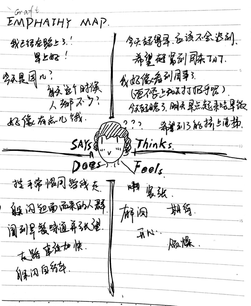
In the work of project2, I conducted a lot of network data research and face-to-face user interviews, and also used Emphathy map to conduct behavioral and thinking research on the people I surveyed.Data research in the Internet age is to use a large number of network user needs to improve the precision and accuracy of design research. It is possible to mine and analyze the user’s behavior habits and personal preferences from behind the complex data, find out the problems and design goals that are more in line with user needs, and adjust the problems and design concerns in a targeted manner based on the user needs I have investigated. It is the value of data research. User research needs to output user portraits. Previously, I might directly draw up a group of people who felt right based on the conclusions of face-to-face interviews and then began to sort out the research, but this method sometimes seems one-sided and takes a lot of time. But now we can accurately find the target user group of the product through network data, data and screening, so that research becomes efficient and meaningful. And this is also the most obvious benefit of Internet data research for design. That is, user research based on users as thecore. This is the process of create, collect and comprehend in the 5c model. I did experience reasonableness and helpfulness in the process of using it. User research needs to output user portraits. Previously, I might directly draw up a group of people who felt right based on the conclusions of face-to-face interviews and then began to sort out the research, but this method sometimes seems one-sided and takes a lot of time. But now we can accurately find the target user group of the product through network data, data and screening, so that research becomes efficient and meaningful. And this is also the most obvious benefit of Internet data research for design. That is, user research based on users as the core. This is the process of create, collect and comprehend in the 5c model. I did experience reasonableness and helpfulness in the process of using it. Through the design frame of PACT, I can clearly define the question of “what kind of activities a person uses and accomplishes in what environment”. People are the ultimate perceiver of interaction, that is to say, no matter what kind of design we make, it is ultimately used by people. From this point of view, people have always been at the center of the design. Usability is the pragmatic component of user experience, including effectiveness, efficiency, productivity, ease-of-use, learnability and retainability.(ETS of Computer Engineers(UPM)) So I focus more on the user needs themselves, and the differences in people also determine the differences in design. But I think this does not mean that each of us needs a special design. In real life, I often see different people using the same design, so I feel that even though each of us is a different individual , But most people have similar behaviors and common behavioral goals, and interaction is more about the study of user behavior. My final design must be based on the balance of human differences, that is, what I see Those designs that look the same but are used by different people are actually a balance of differences. In this weather app I designed, users are people who need to go out frequently. They have requirements and ideas for weather forecasting and route planning services. Therefore, I must understand the differentiated behaviors of users in different weather conditions and the differences in the use of mobile phones when using different vehicles. For example, people who commute by car and people who ride on bicycles have very different requirements for the use of mobile apps. In some cases, the convenient method of use may be very different in another situation. There are also big differences in security considerations. So I designed travel weather and route guidance inspired by music players, which simplifies many tedious operations of mobile phone navigation. I hope that people can quickly receive APP route tips when it is inconvenient to use mobile phones. I also designed smart sports. The watch terminal hopes that users can receive messages smoothly even when they cannot use the APP with their mobile phones, such as sports cycling.In this project, the 5c model provided a whole set of thinking directions for my thoughts that had no clue at the beginning. From the five steps and directions of create, collect, comprehend, conceptualize and collaborate, the ideas of design and creation are more clearly displayed in front of me, reducing the time I wasted because of clueless thinking.
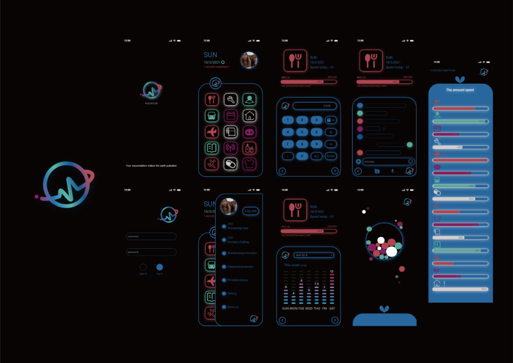
In project4, I made an app about conscious consumption. This mobile app was researched and designed based on the topics provided by CC Awards. The title is “Our consumerist culture means we are fast burning through the planet’s finite resources and in the past three decades alone, one third of our natural resource space has been consumed.” Bringing real happiness and causing serious damage to natural resources and the ecological environment, becoming a conscious consumer and taking appropriate actions is a long and complicated process. Using this as a guide, I designed a mobile phone game about bookkeeping and planning, hoping to guide people to make planned and conscious consumption. I named this design “pulsation”, which means the pulsation of the earth. People save and consume regularly while accumulating energy for the earth that is beating like a heart. In this process, it not only encourages people to actively plan and restrain their daily consumption, but also allows people to see that their daily efforts and every accumulation on the APP are effective in protecting the earth’s resources. People can see more clearly that everyone’s little effort in a lifetime can be rewarded and bring hope to the earth. In fact, this is also an encouraging bookkeeping and accumulation game, which may make users more willing to stick to this matter. Persist in this kind of planned and restrained consumption can see the results, and feel the impact of this kind of plan on their own economic development. I have completed the work of PACT Analysis here, hoping to have enough knowledge and understanding of users, and also use the necessary Internet research data so that it can followpeople’s real thoughts.In this project, the 5c model provided a whole set of thinking directions for my thoughts that had no clue at the beginning. From the five steps and directions of create, collect, comprehend, conceptualize and collaborate, the ideas of design and creation are more clearly displayed in front of me, reducing the time I wasted because of clueless thinking.
I – Interpret the events.
In the study and production of these few, the aspect that I have gained the most is the new way of thinking of this model. I have also thought a lot in the process of interacting design interfaces. In the process of research and design, I spend most of my time researching, thinking and simulating human behavior. In other words, when I design the interface interaction, most of the time I consider how people interact with the environment in a real scene. Everyone may have different concepts for different interfaces, but in real scenes, people actually have similar concepts for many things or processes. For example, people’s understanding of the mouse has the same concept. We hold the mouse as a coherent movement. This kind of thinking actually uses a concept that most people can understand to reduce the burden of understanding caused by interface differences. If you want to reduce the burden of understanding at the interactive level, of course, you should think about the unified cognition and understanding of most people. So I think the final interaction design may move in a unified direction, because the best result that interaction design can bring is to balance the differences in the usage habits of most people. If people have similar conceptual models for things in the real environment, and at the same time the view that “interaction design is based on the real world” is established, then the final result is to look for common commonality on the basis of facing everyone fairly. That is to say, there can only be one balance point for people’s physiological differences. But as long as human behavior is changing, interaction design will not have a unified day. But no matter how different people are, the speed of change in this world is always slower than that in a person’s lifetime. That is to say, in the time interval we can see, the changes in this world may only be so subtle, just like our house. Thousands of years have passed, but there are still doors, windows, and locks. People can still understand the use of buildings in ancient Rome, so our interaction with the environment has not changed drastically.
E – Evaluate the effectiveness and usefulness of the experience
In the production and design of 4 projects and web blogs in this semester, in addition to clear research and thinking, I also benefited a lot from the understanding and research of interaction design. For the interactive design of the interface, I think what needs to be done is to get inspiration from real life and express these behaviors in the language of the interface as high-fidelity as possible. This is also the reason why I didn’t design the interface as soon as I came up. I still need to continue to research and understand the user group, because mobile devices only help us solve the same problem in different ways, and the process of solving the problem hardly happens Essential change.
P – Plan how this information will be useful to you.
I realize that interaction design is a relatively complex and comprehensive subject. The direction of learning and definition is closely related to people’s behavior, and it is necessary to be able to predict the impact and understanding of users during the use of the product. It is necessary to explore the dialogue between products, people, culture, history and material, andeven society. This plays a vital role in understanding user needs. This is more like a work of emotional integration and requires me to have a relatively keen sense of research.
Reference
2014. User experience design. [ebook] ETS of Computer Engineers ( UPM ) . Available at: <http://oa.upm.es/34684/1/PFG_PAU_ROSELLO_VAN_SCHOOR.pdf> [Accessed 16 May 2021].
rl1c20@soton.ac.uk
I’m Fu Ruolin, a student at the University of Southampton.
The university has studied product design and big data visualization.
“Book from the Ground”
In this blog, I want to introduce Xu Bing’s “Book from the Ground”.
“Book from the Ground” is a readable novel, written in a set of “marking language” collected and sorted out by Xu Bing over the years.
Regardless of the reader’s cultural background, as long as he is involved in contemporary life, he can read this book.
I think this is a very interesting reading experience because anyone with any language background can understand it.
It does not require readers to use any existing textual knowledge, but can be read by directly comparing with the real life logic and things themselves.
The ability to read it does not mainly depend on the reader’s educational level and book knowledge, nor does it need to be obtained through traditional educational channels, but depends on the amount of life practice and experience, and the degree of reader’s involvement in contemporary life.
..
No matter what kind of cultural background, what kind of language you use, as long as you have contemporary life experience, you can read this book. Illiterate people can enjoy the pleasure of reading just like intellectuals.
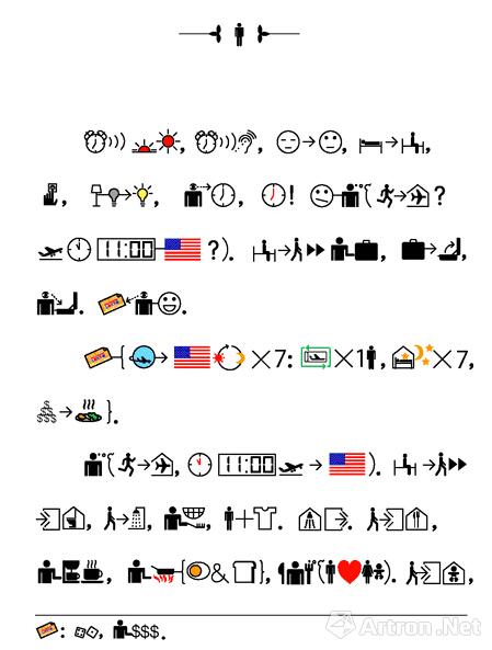

Xu Bing’s art is mostly related to words, which began with a work called “Book of Heaven” twenty years ago.
It is called the “Book of Heaven” because it is a book that no one in the world can read, including Xu Bing himself.
Now Xu Bing uses this “marking language” to write another book that anyone who speaks any language can understand. Xu Bing calls it “Books from the Ground”.
In fact, these two books have something in common: no matter what language you speak or whether you are educated or not, they treat everyone in the world equally.
